
Print Magazine asked four designers to imagine what a legal pot package might look like. Here's what they produced.
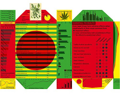
Lust, a graphic design practice in Amsterdam, tackled the controversy of the product head-on---albeit in a very dry, very arch manner. They opted to cover the package in infographics about weed, and its effects--which they claim would create an anti-brand brand, and also, presumably, turn the product into something more neutral than the demon weed. The only stoner reference is the Jamaican & Rastafarian color themes:

The New York office of Base worked with its branches in Europe, to create a goofy nod towards weed's illegal past, with containers made from repurposed packaging from other brands--in other words, a reference to the stash boxes ubitquitous in dorm rooms all over the country:

Strømme Throndsen, an Olso firm that won the 2009 Award for Design Excellence for its flour packaging, produced the design strategy most likely to make it to the real world: Their packaging concept is modular, with a big box containing smaller packages, so that the user need only take whatever they need with them. Inside, the invididual cases could be branded to suit different demographics--which, by the looks of it, would include a red-eyed Apple designer and Paris Hilton:

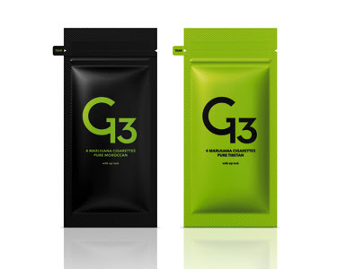

The Heads of State, a Philadelphia duo comprising Jason Kernevich and Dustin Summers, wanted to stick with the illicit connotations of the drug--pointing out that to eliminate that bad-boy rep is to do a disservice to the product (and it's various brand connotations). So they kept the whole "bag of weed" concept, and branded the various strains with goofy stickers:

Read more about all the entries at Print.
Thank you brazer!!!
[via]
Lust, a graphic design practice in Amsterdam, tackled the controversy of the product head-on---albeit in a very dry, very arch manner. They opted to cover the package in infographics about weed, and its effects--which they claim would create an anti-brand brand, and also, presumably, turn the product into something more neutral than the demon weed. The only stoner reference is the Jamaican & Rastafarian color themes:


The New York office of Base worked with its branches in Europe, to create a goofy nod towards weed's illegal past, with containers made from repurposed packaging from other brands--in other words, a reference to the stash boxes ubitquitous in dorm rooms all over the country:

Strømme Throndsen, an Olso firm that won the 2009 Award for Design Excellence for its flour packaging, produced the design strategy most likely to make it to the real world: Their packaging concept is modular, with a big box containing smaller packages, so that the user need only take whatever they need with them. Inside, the invididual cases could be branded to suit different demographics--which, by the looks of it, would include a red-eyed Apple designer and Paris Hilton:


The Heads of State, a Philadelphia duo comprising Jason Kernevich and Dustin Summers, wanted to stick with the illicit connotations of the drug--pointing out that to eliminate that bad-boy rep is to do a disservice to the product (and it's various brand connotations). So they kept the whole "bag of weed" concept, and branded the various strains with goofy stickers:

Read more about all the entries at Print.
Thank you brazer!!!
[via]